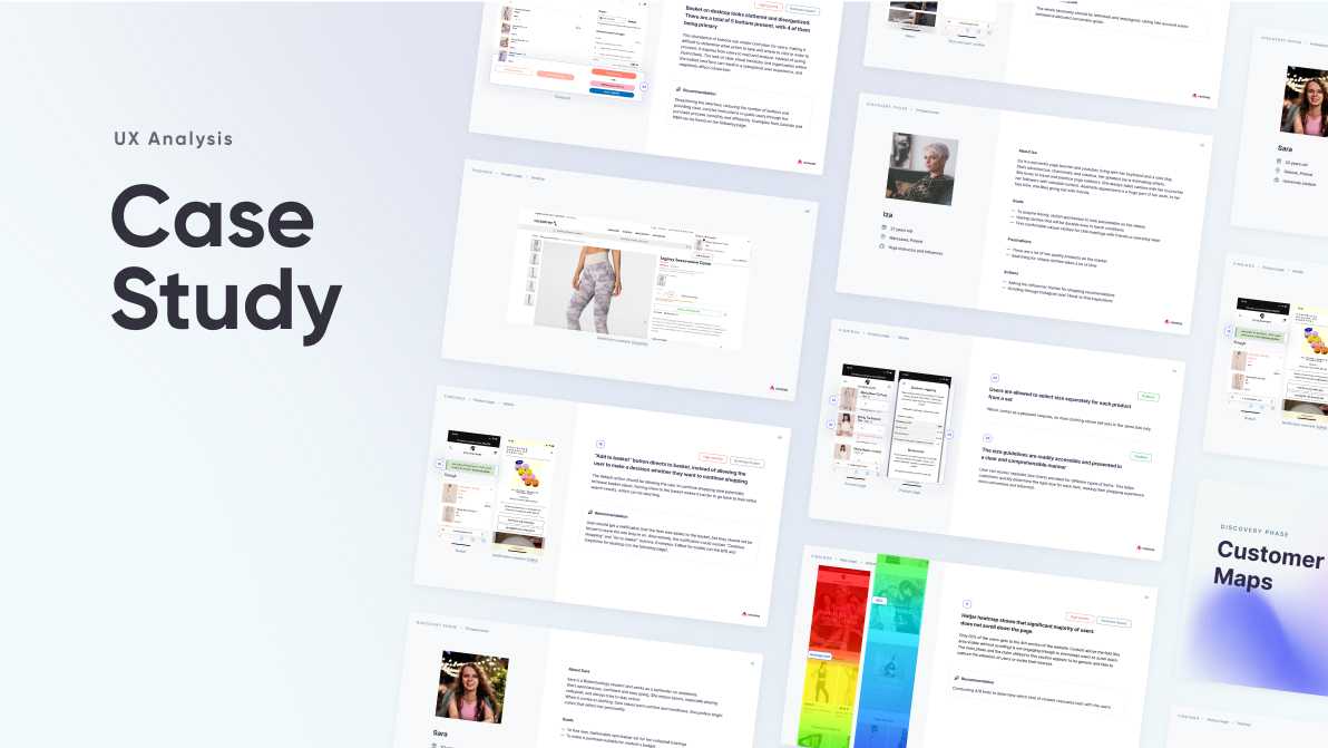
Case Study: UX Analysis for a Fashion E-commerce Brand

Introduction
Imagine a bustling e-commerce store, selling trendy and comfortable activewear for women. This was the scenario when a German feminine brand approached us to conduct a UX analysis of their online store. Our mission? To identify areas for improvement and enhance the overall user experience. Let’s dive into the journey and see how we tackled this challenge.
The Challenge
The OceansApart brand had a visually appealing website but was facing issues with user engagement and conversion rates. While sales performance has been quite solid, our analysis has unveiled untapped potential within customer journey. While customers are making purchases, we’ve observed a significant number of abandoned carts and browsing sessions without conversion, indicating potential friction points in the user experience. Our task was clear: understand these pain points and provide actionable insights to boost conversions.
Methodology
We kicked off our analysis by conducting a thorough review of the website’s user interface, navigation, and overall user experience. We utilized a combination of qualitative and quantitative research methods, including:
- Internal survey for better understanding of products and business goals of the company
- Google Analytics analysis to gain insights into the behavior and improve the understanding of user’s needs,
- Protopersonas to define the target group
- Customer journey mapping to identify key touchpoints and pain points
- Heatmaps to visualize user interactions
- Competitor analysis to benchmark against industry standards
Key Findings
1. Navigation Issues: Some users found it challenging to navigate through the product categories and filter options.
2. Main page: It’s unclear what’s covered in the sections since some of them seem to have similar content but are located far from each other.
3. Category Listing Pages: Poor filtering can overwhelm users with too many options.
4. Product page: Extensive content requires excessive scrolling and limits access to some options and buttons.
5. Basket & Checkout Process: A lengthy and complicated process was deterring users from completing their purchases.
Recommendations
Armed with these insights, we formulated a set of actionable recommendations:
1. Consistent identity: The brand would benefit from conducting further research on market specifics and user needs to better address them and drive revenue growth.
2. Simplified Navigation: Introduce a more intuitive navigation menu, condense space vertically, and improve filter options to help users find products more easily.
3. Streamlined Checkout: Optimize the checkout process by reducing steps and offering guest checkout options to enhance user convenience.
Development
We were pleased to be involved in implementing necessary changes, quick fixes and introducing new solutions aimed at boosting the conversion rate. Examples are the complete redesign of the top navigation, simplifying the basket and checkout process or introducing a Set Creator feature.
Results
Post-implementation of our recommendations, the brand witnessed a noticeable improvement in user engagement and conversion rates. The simplified navigation and streamlined checkout process led to a noticeable increase in completed purchases.
Conclusion
In the world of e-commerce, a seamless user experience can make or break a brand’s online success. Through our UX analysis and tailored recommendations, we were able to help OceansApart enhance its online presence, improve user satisfaction, and ultimately boost sales. As we continue to collaborate with brands across various industries, one thing remains clear: prioritizing user experience is key to unlocking online growth and customer loyalty.


