Mastering Visual Identity: A Blueprint for Tech Conference Success

In today’s competitive landscape, a strong visual identity is essential for tech conferences aiming to stand out in a crowded field. Let’s delve deeper into each aspect of visual branding, drawing inspiration from industry leaders to craft an unforgettable conference experience.
Define Your Brand Identity
Before diving into design, take the time to define what your conference stands for. It begins with a thorough understanding of your conference’s core values and mission. Take cues from Web Summit, whose emphasis on Before diving into design, take the time to define what your conference stands for. It begins with a thorough understanding of your conference’s core values and mission. Take cues from Web Summit, whose emphasis on technology and innovation permeates every aspect of the event. By clearly defining your brand identity, you can ensure consistency in messaging and design throughout the conference.
Logo Design
Your logo is the face of your conference, embodying the essence of your event in a single symbol. It needs to be memorable and representative of your brand. Consider the iconic logo of Apple’s WWDC, which seamlessly blends the company’s signature apple logo with elements of coding. A well-designed logo not only captures attention but also communicates the unique identity of your conference to attendees and potential sponsors alike.
Color Palette
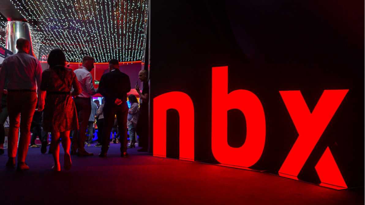
The color palette you choose plays a significant role in shaping the overall look and feel of your conference. Take inspiration from Google I/O, whose vibrant color scheme reflects the company’s dynamic and innovative spirit. Another example of the expressive colors of the event is the Next Block Expo, dominated by deep technological black and intense, energetic red. When selecting colors for your conference, consider how they evoke emotions and reinforce your brand message, ensuring coherence across all visual elements.
Typography
The typography may seem like a minor detail, but it can have a profound impact on the perception of your conference. Look to Adobe MAX for inspiration, leveraging a variety of fonts (including their own custom font) to communicate creativity and sophistication. Whether you opt for sleek sans-serifs or playful scripts, choose fonts that complement your brand identity and enhance readability across various platforms.
Graphic Elements
The color palette you choose plays a significant role in shaping the overall look and feel of your conference. Take incorporating graphic elements into your visual identity adds depth and visual interest to your conference materials. Follow in the footsteps of SXSW, whose use of illustrations, icons, and patterns reflects the diverse and eclectic nature of the event. Another example is Conf3rence, whose characteristic element is a unique color gradient, reflecting the dynamic nature of the Web3 industry. From custom illustrations to branded icons, these graphic elements help tell your conference’s story and engage attendees on a deeper level.
From custom illustrations to branded icons, graphic elements help tell your conference’s story and engage attendees on a deeper level.
Branded Collateral
Consistency is key when it comes to branded collateral, ensuring a cohesive and polished appearance across all conference materials. Take notes from Microsoft Build, whose meticulous attention to detail extends from signage to badges and presentations. Similarly, the organizer of the Next Block Expo conference pays great attention to detail, for which we designed a comprehensive identification, including badges, T-shirts and even water bottle labels! By maintaining a unified visual identity, you reinforce brand recognition and create a seamless experience for attendees at every touchpoint.
Website Design
Your conference website serves as the digital gateway to your event, providing essential information and driving attendee engagement. The Next Web Conference is a great example of a well-designed conference website. TNW’s website is known for its modern and sleek design, with intuitive navigation that allows attendees to easily access essential information about the event. Incorporate interactive elements, such as event schedules and speaker profiles, to keep visitors informed and excited about the conference.
It is extremely important to remember about the mobile version of the website, and not only in the case of a conference on new technologies.
Statistics show that the vast majority of users use a mobile phone to navigate the Internet, which is why it is so important to take care of responsive web design or even go a step further in the context of the event and think about creating a mobile application that is convenient for users.
Promotional Materials
Promotional materials play a vital role in generating buzz and driving attendance for your conference. Follow the lead of GitHub Universe, which uses engaging graphics and compelling messaging to captivate its audience. From social media teasers to email newsletters, leverage every opportunity to showcase what makes your conference unique and compelling.
Feedback and Iteration
Lastly, never underestimate the power of feedback in refining your visual identity and enhancing the conference experience. Like TED Conferences, actively solicit feedback from attendees and stakeholders to identify areas for improvement. Whether it’s refining your logo or fine-tuning your color palette, embrace iteration as a means of staying relevant and resonating with your audience.
In conclusion, mastering visual identity is essential for tech conferences seeking to leave a lasting impression on attendees and stakeholders. By leveraging the insights and examples provided by industry leaders, you can create a visually compelling and cohesive experience that sets your conference apart from the rest.
