Navigating the Challenges: Best Practices for Website Navigation

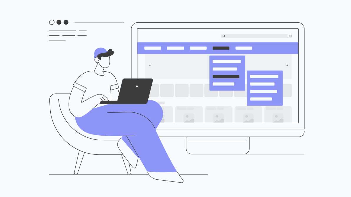
Having a user-friendly website is essential for attracting and retaining visitors. A crucial aspect of website design is navigation, which plays a significant role in guiding users to relevant content and enhancing their overall experience. However, creating effective navigation for both mobile and desktop websites comes with its own set of challenges. Let’s explore some best practices and common challenges in designing website navigation for different devices.
Consistency is Key
Consistency in navigation across devices is crucial for creating a seamless user experience. An excellent example of consistent navigation is the website of Apple. Whether accessed from a mobile device or desktop computer, Apple’s website maintains consistent navigation elements, such as the main menu and search bar, ensuring a familiar experience for users across all platforms.
Prioritize Essential Content
On mobile devices, screen real estate is limited, making it essential to prioritize essential content in the navigation menu. The website of Airbnb is a great example of this. Their mobile navigation menu focuses on key sections, providing quick access to the most important features for users on the go.
Optimize for Touch Gestures
Mobile users interact with websites using touch gestures, such as tapping and swiping. When designing navigation for mobile devices, ensure that buttons and links are large enough to be easily tapped with a finger. The website of ASOS exemplifies this by featuring large, easy-to-tap navigation buttons that enhance usability on touchscreen devices.
Implement Responsive Design
Responsive design is essential for ensuring that your website navigation adapts seamlessly to different screen sizes and resolutions. The website of Nike demonstrates this beautifully. Whether viewed on a smartphone, tablet, or desktop computer, Nike’s website adjusts its navigation layout and menu structure to provide an optimized experience for each device.
Test Across Devices
Testing your website navigation on various devices and screen sizes is critical for identifying potential issues and ensuring compatibility. Amazon excels in this area by conducting extensive usability testing across different devices and user scenarios. Their navigation design undergoes rigorous testing to ensure a smooth and intuitive browsing experience for all users.
Address Performance Concerns
Performance is a key consideration for website navigation, particularly on mobile devices with slower internet connections. The website of Google is a prime example of performance optimization. Google’s navigation design is lightweight and optimized for speed, ensuring fast load times and responsive interaction, even on low-bandwidth connections.
Accessibility Matters
Accessibility is an often-overlooked aspect of website navigation design. The website of Microsoft sets a high standard for accessibility by incorporating features such as keyboard navigation and screen reader compatibility. Microsoft’s navigation design is inclusive and accessible to users with disabilities, ensuring equal access to information for all visitors.
Special case: Navigation for e-commerce store
A particular challenge is to create the perfect navigation for an e-commerce store. When designing menu for e-commerce websites, simplicity and clarity are key. Utilize clear categorization and visual hierarchy to organize a wide range of product categories and subcategories. Incorporate descriptive labels and visually engaging imagery to guide users to their desired products quickly and efficiently. Ensure that the menu is responsive and optimized for mobile devices, allowing for seamless navigation across all screen sizes. Additionally, consider implementing features such as hover effects and interactive elements to enhance the user experience and encourage exploration of your product offerings.
Based on the above principles and suggestions, together with the OceansApart team, we developed a Mega Menu for the oceansapart.com store. The client’s team carefully prepared the structure and categories naming, and we took care of the UX/UI project. The result is a beautiful and functional navigation that enhances user experience and makes navigating the website easier.
In conclusion, effective website navigation is essential for providing users with a seamless and intuitive browsing experience across devices. By following best practices, addressing common challenges, and staying updated with industry trends, you can create navigation systems that enhance usability, drive engagement, and ultimately contribute to the success of your website.
